| Exelon | Fujitsu | First National | Leukemia Society | Kappa | Kraft Foods | SkipJack Press | |||
|
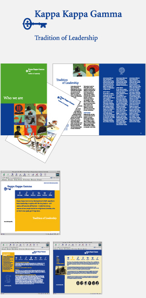
Focusing a Brand Image Kappa Kappa Gamma is a leading women’s fraternal organization. Kappa, like other sororities, was not gaining new members in the numbers it once had and in general the mission and value of collegiate fraternal organizations had come into question. Kappa had a strong story to tell and wanted to get out in front projecting the benefits of sisterhood to members and society as a whole. Our solution was to discover the fraternity’s defensible difference: its ‘pervasive capacity to foster lifelong leadership qualities’ – then to design a logo and visual system to project that specialness and build a renewed, refocused brand image around it. Kappa’s identity was represented by many symbols and graphic elements. The Kappa Key is one of the stronger icons used as a badge worn over the heart signaling ‘opportunity to possibilities.’ The Fleur de Lis is another element representing dignity and grace. These two symbols were brought together in one graphic image, replacing all others as the primary identifier. The Kappa Kappa Gamma name was given prominence and the use of the Greek letters were eliminated from the primary identifier. A competency statement was added to reinforce the fraternity’s position of leadership. Project credits » | Next case study » |
|
||
| Brand & Identity Consulting Services | 212.217.9756 | ©2005 Robin Andrews | all rights reserved |