| Exelon | Fujitsu | First National | Leukemia Society | Kappa | Kraft Foods | SkipJack Press | ||||||||||||||
|
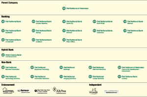
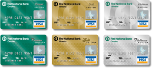
Renewing a Brand Image First National Bank of Omaha is one of the nation’s largest regional banks. Once very secure in their market place, aggressive national competition has been eroding their lead. Its brand look had become dated and its positioning somewhat vague. After review, it was determined that brand equity in the current ‘circle one’ symbol would be maintained with modifications such as a new brand color, contemporized typography and an updated nomenclature system. Its differentiated platform was recrafted to emphasize personalized customer response coupled with major regional banking resources. The previous identifier focused too strongly on the symbol and had no clearly defined brand color. In addition to adding the banking green color (differentiating it from the competitors while claiming the currency color), the typography was enlarged to emphasize the bank name. The friendly and approachable font was maintained but the dated ligatures were removed and initial capital letters were added to create a more responsible banking feel. Formerly, the credit card division was not associated with the bank. A new card design system was developed allowing for the corporate brand and multiple design options. The identity modifications and changes have created a more dynamic and memorable brand presence for First National Bank. Project credits » | Next case study » |
|
|||||||||||||
| Brand & Identity Consulting Services | 212.217.9756 | ©2005 Robin Andrews | all rights reserved |